Speakers of the Welsh language according to 2011 census.
Tags: welsh languageQGISdata visualisationcensus08 Jul 2014 - MawKernewek
Much was written about a relatively small drop in the percentage of Welsh speakers in Wales as recorded by the 2011 census. I'm sure an astronomer wouldn't believe it was anything other than statistical noise if her data showed a 1% change from one survey to another....
Nevertheless, it is possible to visualise the data in a different way to the standard colorised maps you often see about these things.
One way is the restriction of the census output polygons to where buildings exist as the Datashine project did. However their website does not display statistics for Welsh language skills, since the detailed question was not asked to census respondents living outside Wales.
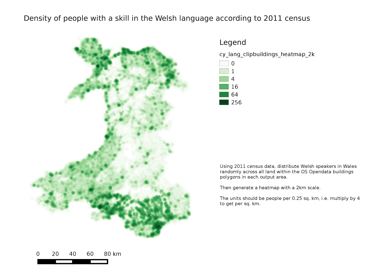
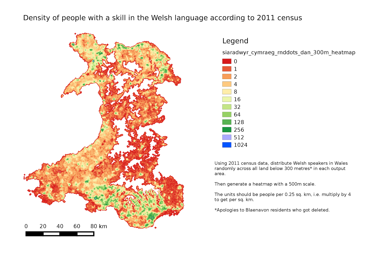
How about we use a QGIS plugin to give each Welsh speaker in Wales (or actually here, anyone claiming any skill in Welsh) a circular piece of land 50 metres wide, randomly located somewhere below 300 metres above sea level in his output census area polygon:

Nevertheless, it is possible to visualise the data in a different way to the standard colorised maps you often see about these things.
One way is the restriction of the census output polygons to where buildings exist as the Datashine project did. However their website does not display statistics for Welsh language skills, since the detailed question was not asked to census respondents living outside Wales.
How about we use a QGIS plugin to give each Welsh speaker in Wales (or actually here, anyone claiming any skill in Welsh) a circular piece of land 50 metres wide, randomly located somewhere below 300 metres above sea level in his output census area polygon:
So here we have the opposite problem to the issues with the typical visualisations with colourised choropleth maps where large but sparsely populated areas dominate visually,namely that denser areas are oversaturated at this scale.
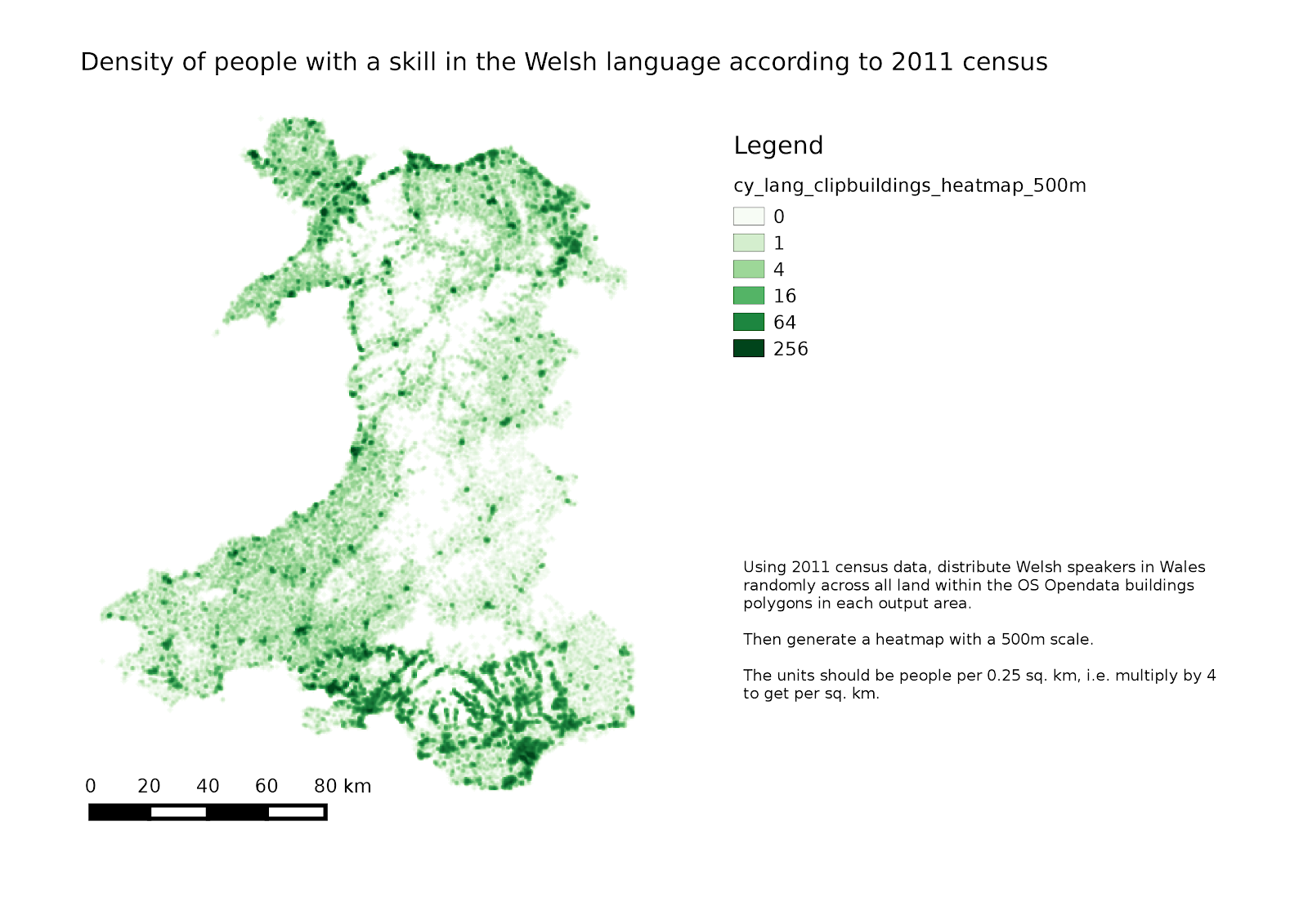
It is also possible to take this random dot distribution and make it into a heatmap (click on the image for a larger version):
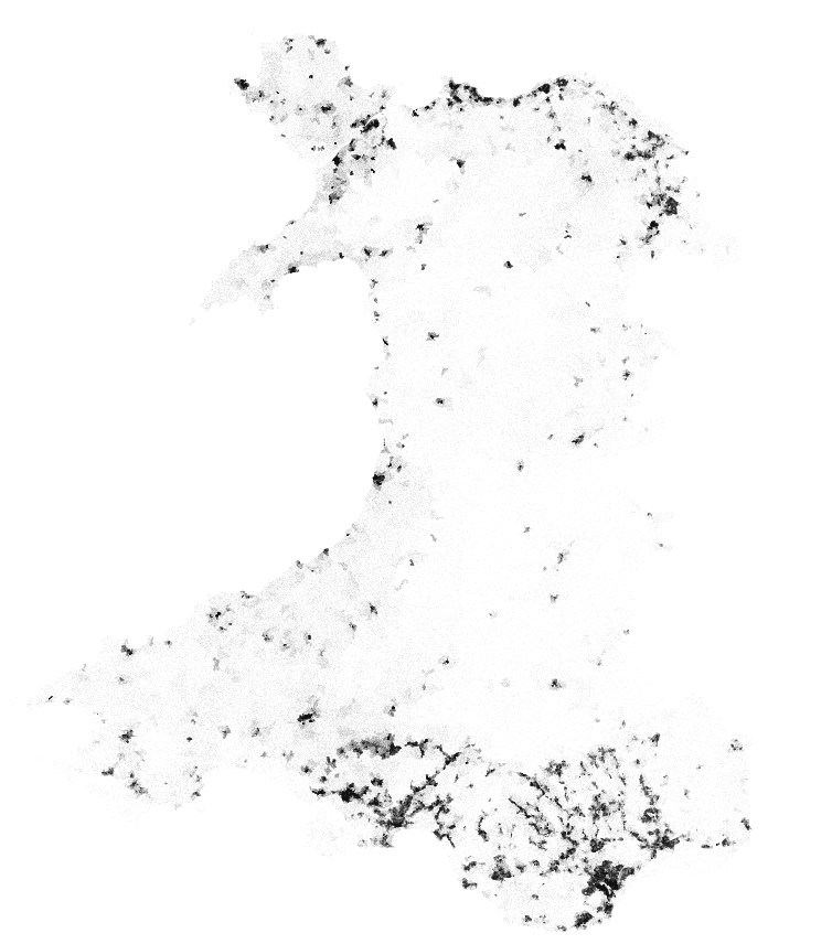
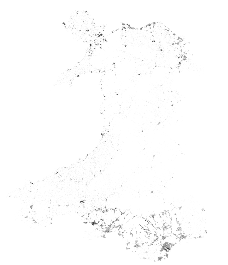
I also downloaded the OS OpenData buildings layer for the relevent grid squares covering Wales, and produced another dots distribution (this took QGIS some time).
This produces the following dot maps, giving each Welsh speaker 50 metre and 20 metre diameter circles of land respectively:
Heatmaps: