Mapping the result of the EU referendum
Tags: QGISreferendumpoliticsEUcartogram27 Jun 2016 - MawKernewek
Since the results of the UK EU referendum were published, a number of maps have been published of the results across the UK.
I have mapped these in QGIS, with the aid of the OS Boundary Line map of local authority boundaries in Great Britain, and Westminster constituencies in Northern Ireland. Both of these sets of boundaries are available as government open data.
I have used data dependent styling in the maps below, which used the following formula:
case when "pc_leave" >= 50.0 then color_rgba( 127,0,255, scale_linear( "pc_leave" ,50,80,20,255))
else color_rgba( 255,255,0, scale_linear( "pc_remain" ,50,80,20,255)) end
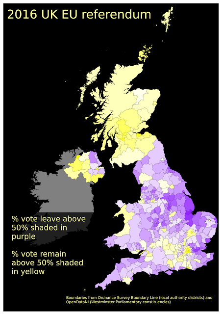
This makes places that had a majority of votes cast for leave shaded in purple, with transparency varied as the percentage who voted leave rises from 50% to 80%. Similarly remain is shaded in yellow under the same scaling. Unlike in General Elections, where parties generally have an established colour scheme, the EU referendum doesn't have a universally accepted colour scheme. I used purple because UKIP uses purple, and yellow because pro-Remain parties LibDems and SNP use it.
Most of my maps retain the geographic rather than a cartogram representation. It is a point of open debate which is better, but I also add another alternative, which is to represent the absolute size of the majority by crosses, by placing a point at a random place within each polygon for each 1000 votes of majority. The other difficulty with these kind of maps is the varying impact based on the visual impact of different colours.
 |
| With a white background |
 |
| With SRTM elevation overlaid (because I can). |
 |
| With a black background. |
 |
| Using QGIS's random dots feature to represent each 1000 voters of majority abs(leave-remain) with a cross. These are not very visible at this scale. |
 |
| Crosses to represent each 1000 votes of majority, using random dots in QGIS. |
 |
| Same as above, but remain is now red, which makes it more visible. |
 |
| With a black background, going back to purple/yellow. |
 |
| A cartogram with the QGIS cartogram plugin, sized by votes cast (not electorate) since this was the data more easily to hand. |