Skrifennow
My blog, imported from Blogger and converted using Jekyll.
« Prev
1
2
3
4
5
6
7
8
9
10
11
12
13
14
15
16
17
18
19
20
21
22
23
24
25
26
27
28
29
30
31
32
33
34
35
36
37
38
39
40
41
42
43
44
45
46
47
Next »
Using QOSM to provide OpenStreetMap basemap in QGIS for my slopelines project
In previous posts I have described how I have used a segmented DEM with RSGISlib, a method originally developed as part of my MSc dissertation on Martian glaciers, for visualising slopes on Earth.
I have been looking at these again, and have produced a few maps with the QOSM plugin, which dynamically loads OpenStreetMap tiles into QGIS.
These maps below were produced with the Thunderforest Outdoors rendering. The slopelines are as previously, red for convex slopes, blue for concave, with thicker lines denoting steeper slopes.
Previous versions of this had used a version of OpenStreetMap that I was preparing myself from the source data within QGIS. Using the basemap tiles I can focus on adapting the visualisation of the slope lines themselves a bit more.
For a while I thought the QGIS bug I found had recurred which meant that the arrows had disappeared. However it was something wrong in my data dependent styling, not sure how it happened. Once fixed, I show the slope direction with arrows, which is only possible up to about 1:10,000 otherwise the rendering struggles:
I have been looking at these again, and have produced a few maps with the QOSM plugin, which dynamically loads OpenStreetMap tiles into QGIS.
These maps below were produced with the Thunderforest Outdoors rendering. The slopelines are as previously, red for convex slopes, blue for concave, with thicker lines denoting steeper slopes.
Previous versions of this had used a version of OpenStreetMap that I was preparing myself from the source data within QGIS. Using the basemap tiles I can focus on adapting the visualisation of the slope lines themselves a bit more.
 |
| Bodmin Moor |
 |
| Camborne and Redruth, including Carn Brea and Portreath |
 |
| Penzance |
 |
| Truro |
 |
| A close up of Truro |
 |
| Indicating the downslope direction with arrows. |
 |
| Delabole, showing the slate quarry. |
 |
| St. Ives |
 |
| Aberystwyth, Wales |
 |
| Cadair Idris, Wales |
 |
| A wider view of Cadair Idris, too small a scale to allow plotting the arrows. |
 |
| Pen y Fan, Brecon Beacons, Wales |
Retrotopia draft map
The author John Michael Greer has been publishing a speculative fiction series currently on his blog, The Archdruid Report called 'Retrotopia'. It is set in around 2065, in a North America that has undergone some changes after the breakup of the USA.
Here is a draft map, based on his descriptions in the comments to a recent post, showing the approximate borders of the successor states to the USA and Canada. I have yet to deal with states that are split between more that one nation in 2065.
I used a map of US counties from here, and US state, and Canadian province shapefiles from here. Update - I switched to using this map of Canadian provinces which includes Nunavut.
I have also used the ETOPO1 bedrock relief topographic map as a background, which shows the elevation of Greenland without the ice sheet. It is perhaps a century or two too early to assume complete deglaciation of Greenland. The portion of Greenland below sea level is not actually connected to the sea here, it would be at a +50 metre sea level as assumed in the 25th century setting of Star's Reach.
The borders of the Retrotopia nations can be seen by the colours, with present-day US states and counties shown as lines.
The shapefile itself containing all of the Retrotopia nations in North America I have made available here.
It is also available as a KML file suitable for use with Google Earth.
Here is a draft map, based on his descriptions in the comments to a recent post, showing the approximate borders of the successor states to the USA and Canada. I have yet to deal with states that are split between more that one nation in 2065.
 |
| The nations of the Retrotopia stories, not including at this time states that are split between more than one Retrotopia nation. No account of sea level rise is made, which is assumed to be 6 feet above present day levels. |
I have also used the ETOPO1 bedrock relief topographic map as a background, which shows the elevation of Greenland without the ice sheet. It is perhaps a century or two too early to assume complete deglaciation of Greenland. The portion of Greenland below sea level is not actually connected to the sea here, it would be at a +50 metre sea level as assumed in the 25th century setting of Star's Reach.
Update
I have made some updates based on further descriptions based on John Michael Greer's comments, which account for the states that are divided:The borders of the Retrotopia nations can be seen by the colours, with present-day US states and counties shown as lines.
 |
| The Lakeland Republic is not labelled since the Free City of Chicago label has prevented it from appearing. |
 |
| In this case the Lakeland Republic label wins out. |
 |
| These are the borders of the western areas, as far as I understand JMGs comments. |
 |
| Close-up of the north-east former USA and adjacent part of Canada. |
 |
| Black and white version. |
The shapefile itself containing all of the Retrotopia nations in North America I have made available here.
It is also available as a KML file suitable for use with Google Earth.
 |
| Showing 2 meters of sea level rise in blue, with 2-4 metres shaded in lighter blue. |
Mapping the result of the EU referendum
Since the results of the UK EU referendum were published, a number of maps have been published of the results across the UK.
I have mapped these in QGIS, with the aid of the OS Boundary Line map of local authority boundaries in Great Britain, and Westminster constituencies in Northern Ireland. Both of these sets of boundaries are available as government open data.
I have used data dependent styling in the maps below, which used the following formula:
case when "pc_leave" >= 50.0 then color_rgba( 127,0,255, scale_linear( "pc_leave" ,50,80,20,255))
else color_rgba( 255,255,0, scale_linear( "pc_remain" ,50,80,20,255)) end
This makes places that had a majority of votes cast for leave shaded in purple, with transparency varied as the percentage who voted leave rises from 50% to 80%. Similarly remain is shaded in yellow under the same scaling. Unlike in General Elections, where parties generally have an established colour scheme, the EU referendum doesn't have a universally accepted colour scheme. I used purple because UKIP uses purple, and yellow because pro-Remain parties LibDems and SNP use it.
Most of my maps retain the geographic rather than a cartogram representation. It is a point of open debate which is better, but I also add another alternative, which is to represent the absolute size of the majority by crosses, by placing a point at a random place within each polygon for each 1000 votes of majority. The other difficulty with these kind of maps is the varying impact based on the visual impact of different colours.
 |
| With a white background |
 |
| With SRTM elevation overlaid (because I can). |
 |
| With a black background. |
 |
| Using QGIS's random dots feature to represent each 1000 voters of majority abs(leave-remain) with a cross. These are not very visible at this scale. |
 |
| Crosses to represent each 1000 votes of majority, using random dots in QGIS. |
 |
| Same as above, but remain is now red, which makes it more visible. |
 |
| With a black background, going back to purple/yellow. |
 |
| A cartogram with the QGIS cartogram plugin, sized by votes cast (not electorate) since this was the data more easily to hand. |
Federation Membership referendum
Here are the arguments for remaining in vs. leaving the Federation to help you decide how to vote in the referendum on Thursday 23rd June 2366:

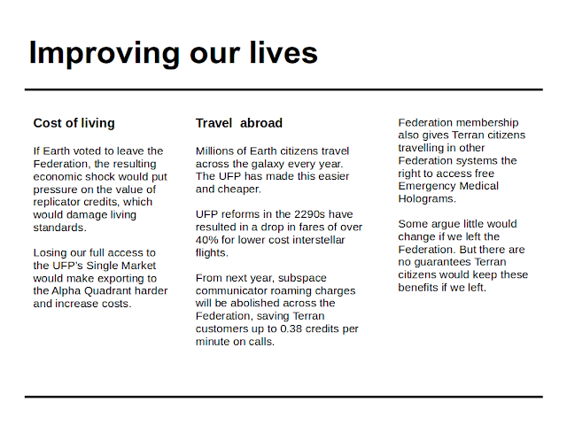


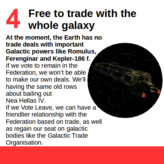

Remain


Leave


Atmospheric correction of Sentinel 2 images
I recently downloaded the Sentinel Application Platform including the Sentinel 2 Toolbox.
This looks to be a fairly fully featured image processing program, but what I was most interested in doing is the atmospheric correction for the Sentinel2 images I recently downloaded.
The Sentinel 2 'sen2cor' plugin accomplishes this, which wasn't too difficult to install, making use of anaconda to manage the various dependencies. Once I managed to get the environment variables set, and have it find all of the libraries it pretty much just worked.
After this, I tried using my own script for stacking the bands, which came out with a non-georeferenced image. I then noticed I could save the layerstacked image as a GeoTIFF/BigTIFF from within SNAP. A single 'granule' of Sentinel2 resampled to 10m produced a 9GB GeoTIFF, so I converted to KEA with gdal_translate.
 |
| Sentinel 2 image processed to Level2A, with SNAP and sen2cor. Bands B11/B8/B4 |
 |
| Zooming in on the Truro area. Penryn can be seen at the lower-left. |
 |
| Using my rsgislib-landexplorer program to juxtapose geotagged ground-level images with Sentinel2 |
 |
| The same as above, but the non-atmosphere corrected version of the Sentinel2 image. |
« Prev
1
2
3
4
5
6
7
8
9
10
11
12
13
14
15
16
17
18
19
20
21
22
23
24
25
26
27
28
29
30
31
32
33
34
35
36
37
38
39
40
41
42
43
44
45
46
47
Next »